It’s funny. I heard about Taryn when I was doing the Bright Ideas Gallery and I was looking for teachers for the who were using technology in classrooms. I contacted Taryn, and somehow we got around to talking about classroom design instead.
She told me about her frustrations with her classroom: it was difficult to move around, it seemed too busy, and it was impossible for project work. Her biggest problem I heard was the classroom just didn’t FEEL right; it did not fit with her personal style of teaching.
Taryn came to my classroom and we talked some more. I told her about the Third Teacher, and then I visited her class in action. I took a few photos and sent her some suggestions, (e.g reduce the visual noise, use more of the natural lighting from the window, etc.).
Months later, Taryn invited me back to her classroom, and I was astounded by the transformation. It was like one of those design shows on TV!
Below are some before and after shots. I grouped them into different areas of the classroom starting in one corner and proceeding to the right.
Corner 1
Before
After
Taryn got rid of the Word Wall and colourful borders to reduce the amount of visual stimulation. She did keep up displays, like the CAFÉ chart, that she uses on a regular basis. She brought down the overhead lighting and replaced it with soft lights that accent cozy spots. Notice the coffee table for group or project work.
Front of the Classroom
Before
After
Again, Taryn eschewed bright borders and backing paper in favour of no borders, neutral backgrounds, and muted earth tones for a soothing, cohesive feel.
For sitting in the whole class area (campfire), she has low tables, a faux leather ottoman, and had her husband build multi-level risers after seeing mine. (His are better built).
Corner 2
This was an useable spot for work originally. I think it was used for storage (behind that rolling trolley).
After
Taryn turned it into this beautiful oasis, that is sectioned off visually with the sheer curtain, which still affords visual contact and supervision.
She brought in a nice bookshelf, a carpet, and some throw pillows. ON the shelf are the students’ photos of their families to keep that great homey feel. A great stress reliever.
Window Area
Before
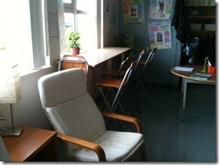
Taryn had her storage trolleys, two filing cabinets, and some book displays made of PVC gutters blocking access to her beautiful windows.
After
She got rid of all of it. The windows provide great natural light especially to the reading nook above in the corner, and high stool area. Again, she got her handy hubby to create a high riser so students could work while sitting on the stools.
Cloakroom
Before
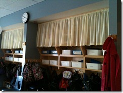
Oddly, when the school was built, to save money, no doors were installed on the cloakroom.
After
Taryn covered the top layer with a removable curtain to hide the seldom used items up top. Student materials on the next layer down are stored out of sight in storage bins. Taryn left the hook area open for easy access.
Sink
Before
After
Taryn again covered unsightly storage items behind a small, neutral curtain. She also added some greenery to add to the natural elements of the classroom.
Taryn accomplished all of her goals for her learning space. She created inviting common areas and got rid of some of her students’ desks to create more flow. There are a variety of breakout spaces for individual and group project work. The chaotic décor is replaced with soothing tones and low lit or naturally lit spaces. And most of all, the environment fits Taryn warm personality and the connections she makes with her students at a personal level. Now her classroom feels right. Taryn’s students are thrilled with their classroom and were excited to be in on the process.
For Taryn’s full story in the Bright Ideas Gallery, click here.


No comments:
Post a Comment