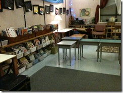
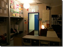
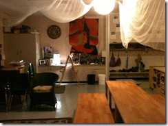
Here are some Before shots:
They set to, and I was impressed with how harmonious the moves went. They didn't seem to have an overall plan, but they definitely went to the places that they wanted to change the most. The big targets, which also happen to be the biggest pieces of furniture, were the risers and the rolling storage bins. Small teams of students clustered around them and then decided where they were going.
Another partnership rolled up the gold carpet (the third picture above). I bought the huge, almost new carpet at a garage same for $5! I thought it was such a great deal … until we sat on it with dark pants. The shedding fibres made it look like we’d been mauled by a Golden Lab with dermatological issues. But until recently, we kept the carpet because it added to the warmth of our classroom. They replaced the carpet with the very utilitarian grey carpet remnant. We filled in the blank spot at the back where the grey carpet had been with the unraveling indoor/outdoor carpet we’d had in our class a long time ago. (I’d moved it into the the teacher oasis I created a while back. Incidentally, I moved the gold carpet into the teacher space, as we don’t roll around on the floor too much).
The students dismantled the horseshoe that the risers formed. I was disappointed because it really added to the communal feeling we had, especially during instructional times. Though they dismantled the riser horseshoe, they created another smaller horseshoe with the rolling storage bins.
The After and the Reasoning
I was a little dumbfounded about their choices and moves, so we debriefed afterward. I was blown away! Weeks ago, I showed them the set up of the Apple Store, and they really liked the zones created by furniture there. The zones were flexible, but each emphasized different kinds of activities and interaction. They had set up our class in the same manner! The carpet at the front is intended for instruction because it allows all of us to see the Smartboard as I am giving instructions.
Here is the Campfire area they created:
At the Apple Store, they liked a private space where people could turn their backs or be shielded from distractions for concentration and privacy. With the rolling bins, they created a cave of silence. Students can go inside the the horseshoe or they can stand and work at one of the rolling bin carts. There are additional silent, private spots at the back window counter and the easel.
Here are the Caves the students created:
The rest of the riser and carpet spots were set up for individual, partner, or small group work. They moved the risers so that people could talk or work, but they dismantled the horseshoe so that the small groups did not interfere with each other. They recognized that when all of the talking groups were together in one tight spot, it got too loud. With the risers being separated, now they had three different zones for interaction, instead of just one. Notice that they kept the picnic bench set up of the long risers so they could sit on either side and talk across it.
Here are some Watering Holes the students created:
I don’t ever remember telling my students about the Campfire, Watering Hole, and Cave concepts. Regardless, they see the need for such zones for themselves. Notice that they also kept some desks for people who want their own space. They also put them in front of our classroom library. Just like the Apple Store, we try to keep the unsightly rows of items that are stored on shelves blocked from view. In this case, the desks block the books. At the back counter where there are other shelves with things stored on them, I tried suspending a taffeta curtain. It gets pulled down by people’s feet, so I am looking for a better solution.

There is definite pride of ownership. Right after reorganizing the classroom, we had a school-wide writing activity where students were allowed to go anywhere in the school to write. None of my students left our classroom. Though there are still some problems with our classroom, (I miss our horseshow for discussions where everyone can see everyone else), the benefits outweigh the drawbacks. The students are proud of their classroom, they use the spots appropriately because they designed them for their own purposes, and the classroom seems bigger. I was trying to figure out on my own how I was going to create Caves in our classroom for the last few months. In the same time it takes for my students to clean the classroom at the end of the day, my little designers fixed a lot of the problems I was working on.
A useful 12 minutes.


Thank you to those people who thought I was doing my PhD. The "I" stood for the real PhD student's initial, not for "I" as in me. But it warms my heart to think that people think enough of me to think I am doing my doctorate. (That's a lot of thinkin).
ReplyDelete